Edit Form Questions
Form Question Editor
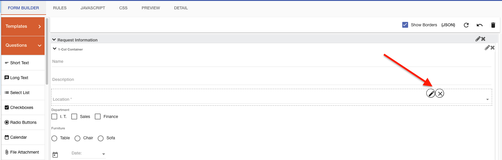
To edit a Question that has been added to a form, select the Pencil  icon:
icon:
A dialog window will open that will contain the following:
Each tab item on the Question Information configuration panel has a specific purpose concerning a question's overall configuration:
- Basics: basic question settings.
- Multichoice Options: will appear for Checkboxes, Radio Buttons, and Select list questions to manually add question choices.
- DB: define database queries for Checkboxes, Radio Buttons, Select lists, and Search box question types.
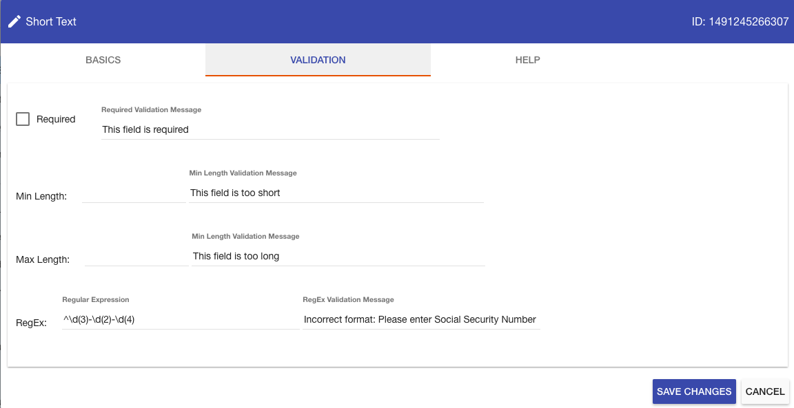
- Validation: all for regular expression entry and custom validate on short text question
- Help: this allows the end-user to add custom help text for questions.
The following will describe each configuration area.
Settings
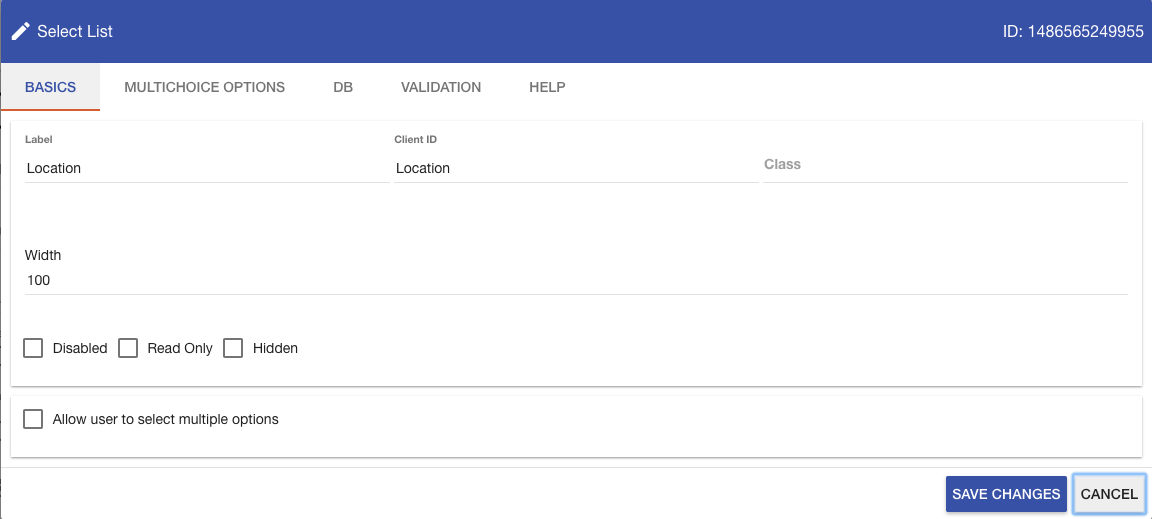
The Basics tab is displayed for any question on a form regardless of the question Type:
The Question Basics tab allows you to update information such as a question‚ label or width size of a question.
- Label (required): Defines the label displayed, by default, to the left of any question added to the form.
- Client ID: Defines an identifier that the system uses to match questions from the instance database table in Integrify to the form. Client ID's are referenced in Prefills and JavaScript.
- Disabled: A checkbox that, when selected, the field becomes unusable. The user can't edit or highlight to copy the text in the field.
- Read-Only: A checkbox that, when selected, the field becomes readable, only removing the ability to modify.
- Hidden: A checkbox that, when selected, the field becomes usable but does not display.
- Class: Allows you to apply CSS to specific questions within a form; by defining a class on the question, you can add that class to the CSS tab and apply specific formatting (font color, size) to any question with that class.
- Width: The percentage of the column that the question takes up.
DB
The DB tab is an optional configuration for the Checkboxes, Radio Buttons, and the Select List questions. It is, however, required for any Search Box question.
This question configuration enables you to dynamically bind and populate the contents of the Checkboxes, Radio Buttons, and the Select List questions.
For example, perhaps you would like to have a Select List on your form that contains the current job titles from your HR system. It is possible to define the appropriate database query and database connection in this area to connect to your HR system and retrieve that list of data each time that form is displayed to the end-user.
To retrieve data, a few key items must be configured on the DB tab.
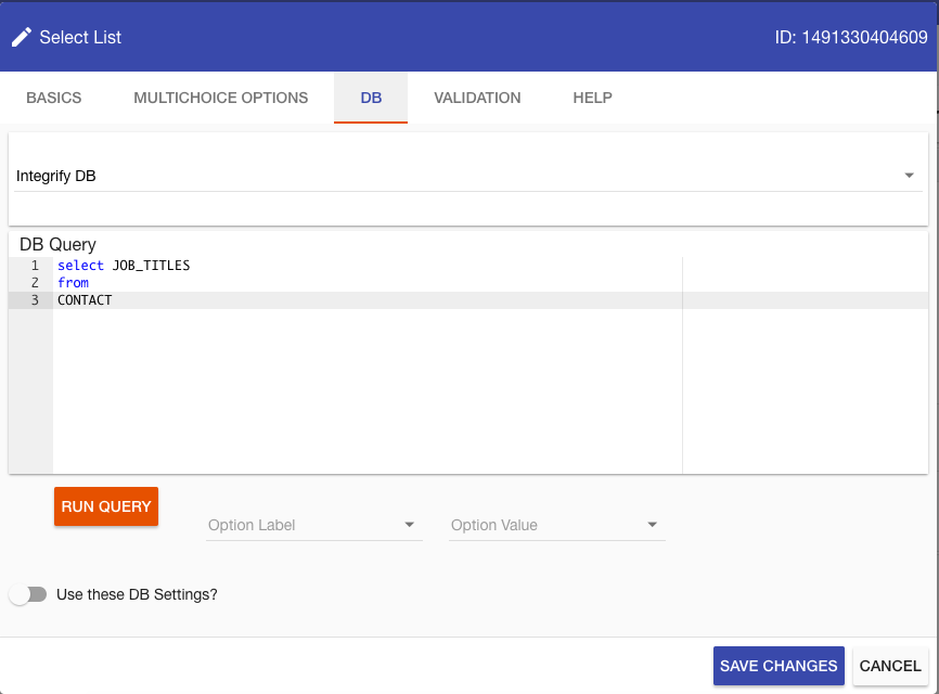
At a minimum, it is necessary to add a DB Query and map both the Option Label and Option Value. In the example above, the query is looking at the internal CONTACT table. By default, if no Database Connection String is added, the Form rendering engine will try to execute the query against the Integrify database.
The following describes all of the Database Lookup configuration options:
- DB Query (required): Any SELECT query that will retrieve one or more rows of data and one or more columns for data. Example:
Select contact_id, last_name, first_name
From contact
Order by last_name, first_name
It is possible to use alias such as:
Select contact_id, last_name + ‚", ‚" + first_name as FullName
From contact
Order by last_name, first_name
Additionally, it is possible to use parameters in the where clause of your query. These will be populated at process runtime:
Select contact_id, last_name + ‚", ‚" + first_name as FullName
From contact where first_name = @firstname
Order by last_name, first_name
- Option Label (required): this field is mapped to a specific field column or alias defined in your DB Query, such as LAST_NAME or FullName. The DB Label Column represents the visible portion of the HTML control the end-user can see. For example, in a Select list, that would be the text in the drop-down list. For a series of checkboxes or radio buttons, the value is the label displayed for each item in that series.
- Option Value (required): this field is mapped to a specific field column or alias defined in your DB Query, such as CONTACT_ID or FullName. The DB Value Column represents the value that can be associated with a DB Label. For instance, in a list of job titles, the end-user may see Area Manager; however, the value associated with that particular option may be a job code value such as AREAMGR_01.
- Select Database (required): a database needs to be selected for the values to be returned to the question.
Validation
The Validation configuration enables you to add a Regular Expression that will be executed when a form is submitted. A custom message is displayed to the user if the text entered in a field does not satisfy the regular expression.
Note: For short and long text question types, you will also have the Max Length option.
For example, perhaps you would like to have a Social Security Number field, and you only want the end-user to submit the data in the format of "XXX-XX-XXXX." You could add three separate questions on the form to represent each portion of the social security number, or you could add a single text field and add some custom validation:
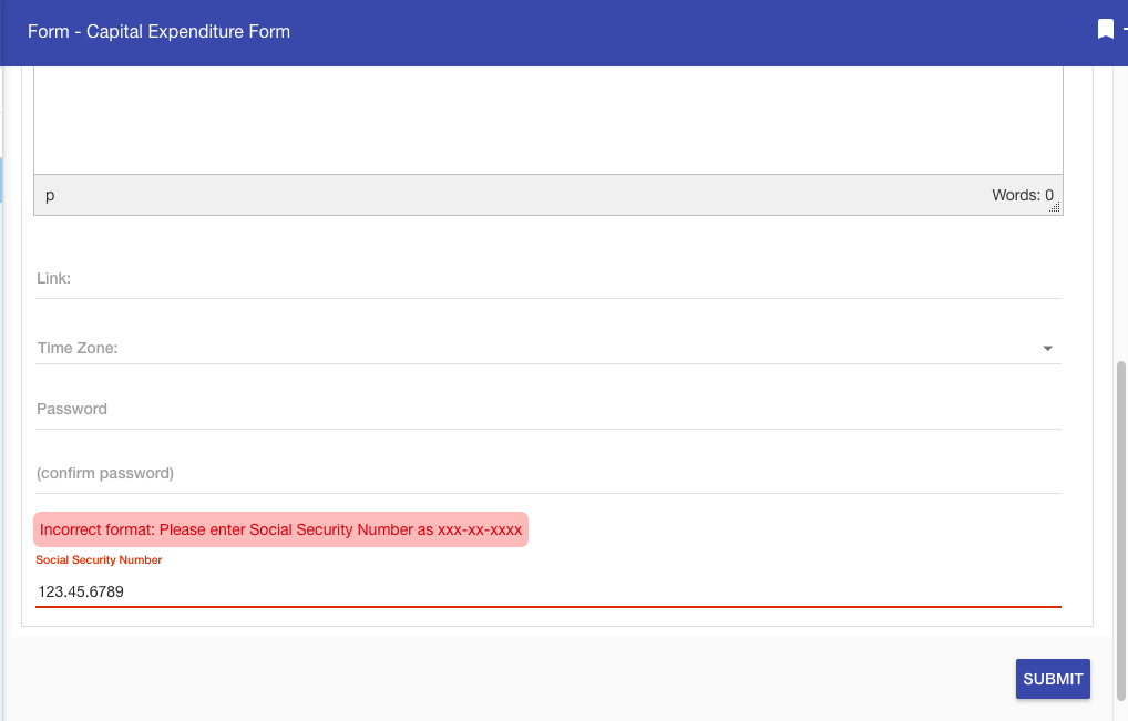
In the example above, the user entered the SSN as 123.45.6789. Then, Integrify executed the regular expression against the value entered to see if it matched the pattern XXX-XX-XXXX when the form was submitted. It did not, so the custom message was displayed.
To add this additional validation, select the Validation tab and enter both a Regular Expression and Message in the fields provided:
Note: There are slight nuances with regular expression syntax. Since Integrify is based on the Microsoft .NET platform, it is best to use the syntax that works for the .NET framework.
Also, there is an optional Required checkbox within the Validation that, when chosen, the field becomes required.
MultiChoice Options
The MultiChoice Options tab will only appear for the Checkboxes, Radio Buttons, and Select List question types. These question types all support the ability to display multiple options and/or select multiple options for a question on the form.
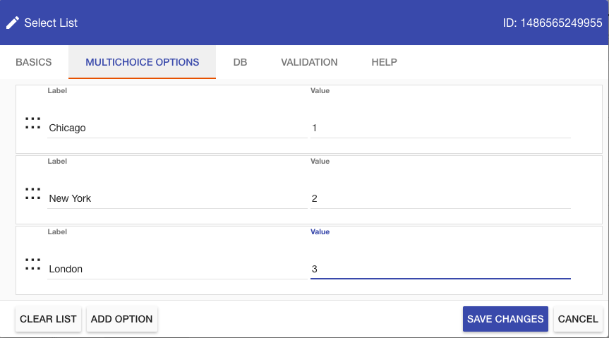
To add a new question choice, select Add Option and type in a Label, a Value, and either select Save Changes to exit or Add Option to add another choice.
There is a distinction between the Label and Value entry when adding a question:
- Label: The label indicates the label displayed next to a checkbox or radio button or the text displayed in a drop-down list to the end-user.
- Value: Each question choice may have a distinct value that is different from the displayed label. In the example above, London is displayed to the end-user, but the value 3 is stored in Integrify if selected.
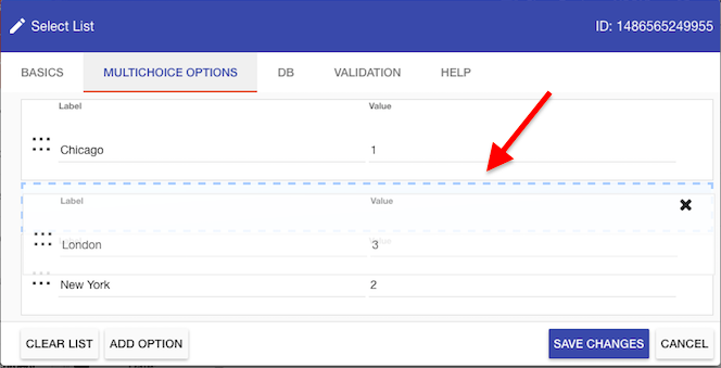
Once a Question Choice has been added, the order of the choice list may be re-arranged by clicking and dragging the option up or down the list (similar to re-ordering the Questions on the form within Form Builder). The change in the order alters the order in which the checkboxes, radio buttons, and select lists are displayed to the end-user on the form:
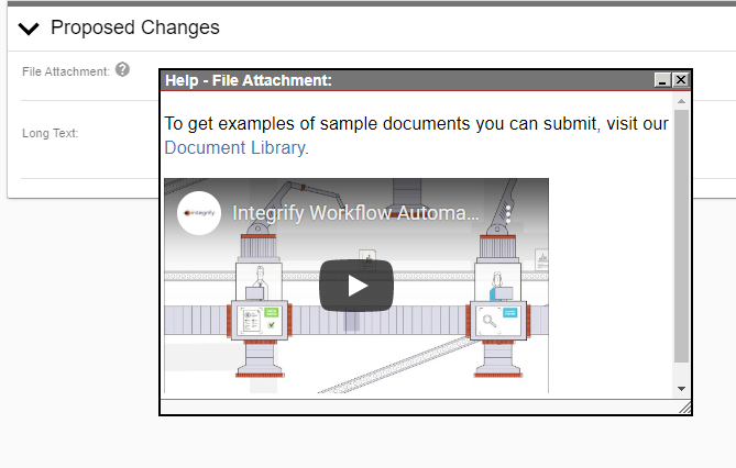
Help Text
The Help tab is where you can add helpful user text relevant to the form question. For instance, an explanation of what kind of answer or information is expected when answering the question.
Once the text has been added to the Help tab, a circular icon containing a question mark will be added to the form next to the question.
When clicked, the Help Text Icon will open a window containing Rich Text that can include formatted text, images, links, videos, symbols, emojis, and source code, as you can see below.